
Creating a personal website doesn’t have to be hard.
Yes the process can seem intimidating, and it does take a little work to figure out how you want to represent yourself. But if you’re feeling overwhelmed, remember that your website doesn’t have to be this multi-page, multi-media endeavor to be impressive. In fact it doesn’t even have to be more than a single page.
Don’t believe us? As proof that a one-page website can really make your personality and professional experiences shine—and help you land you your dream job, we’ve gathered 22 of our favorites. Check them out for inspiration, pick up a few pro tips from their successes, and then follow our instructions to build your own website in no time at all.
1.
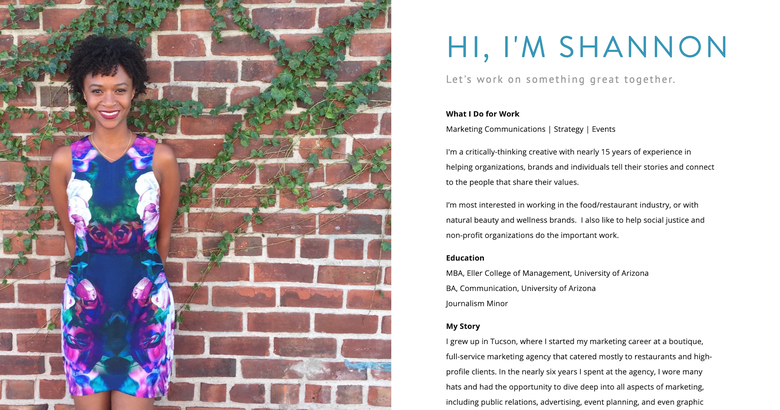
By choosing a bright photo of herself, Franklin balances out the simplicity of the other half of her site nicely and ends up with a splashy page that will make anyone want to learn more.
2.
This website is the definition of basic. And while there could be a bit more info—like links to his work samples—this is a great example of a page you could get up super fast while working on something more robust (I’m talking 10 minutes, especially if you use a one-page website template like Squarespace’s cover pages).
3.

In case you were doubting that you could build your own website, Greg Levine is proof positive that anyone can. Levine threw his original landing page on the web in less than an hour after reading our article on resume websites—and while it’s been updated since, it’s still a one pager that gets the job done. (And get the job done it did—Levine informed us that he landed a new gig just under a month after building it!)
4.
This is a unique instance where calling something minimalist might be an overstatement. Samadzadeh shows that she’s a writer, editor, computer programmer, and sewist all in a single white page that looks more like a printed out resume than what you might think of as a personal website. But it serves as a single hub for links to all her work and how to get in contact with her along with a brief explanation of her career history.
OK we’re cheating a little here—Samadzadeh’s “Sewist’s Statement” is in fact a second page, but it’s all about how she will not make a career out of sewing, so all her work info is contained to one page.
5.
This is another simple single-page website with social buttons at the bottom. You get a basic sense of Gamache’s work and aesthetic, and then have plenty of options to explore his work further.
6.
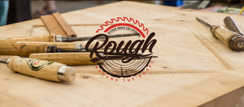
This one-page site quickly gives you all the information you need before you decide whether you want to commission something from Bowe’s woodworking business, including his background, pictures of his work, and a contact form to get started—showing how even if you’re selling a product, sometimes one page is plenty for your site.
7.
Even though Oconnell is a creative and probably has a pretty impressive portfolio he could show off, he doesn’t host his creative work here. Instead, he keeps it basic but with a little personality, and then allows people to explore his work on whichever social platform they’re most interested in.
8.
Ellis uses a scrolling one-page site to include all the information anyone need to know about her as a freelance writer, including samples of her work, testimonials, additional services she offers, and even her resume. Writing is not her day job, but you don’t see that until you’ve scrolled to her resume—making this a great example of how to lead even a single-page site with the most important information you want to broadcast.
9.
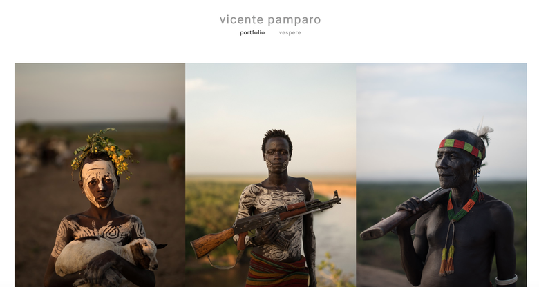
This one-page photography portfolio really lets the pictures speak for themselves—there are only 4 words on the entire site!
10.
Even if you don’t have a giant and beautiful photo of yourself, if you have a decent LinkedIn or Twitter photo, you can still take this approach. Just follow Strobel’s lead, creating a split site with a brightly-colored background and a thumbnail image.
11.
Allardice’s site uses a split screen where one half of the page stays the same while the other scrolls. As an author, he wants to keep his book front and center, so he keeps the cover image present on the left while you read through the rest of his information on the right.
12.
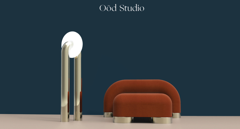
This furniture design studio’s single-page website gives you just enough information so that you know what you’re looking at and then lets the pictures of their designs do the rest. If you like what you see, there is a link to founder Jessica Herrara’s more detailed, multi-page site.
13.
We love how Haas uses the different sections of this single page to bring together the different parts of herself—such as her writing and speaking. The menu bar at the top makes it easy for us to find what we’re looking for, or we can scroll if we’d rather just browse.
14.
While other sites on this list can be called online resumes, Durham’s can probably more accurately be described as an online business card. There are a few links to projects at the bottom, but otherwise this sleek site just states his name, job, and contact information.
15.
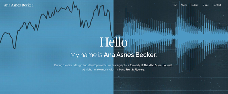
Becker’s got it good—given that she’s a talented creative professional, she has tons of visuals to make use of. And make use of them she does—we love how she has very little text on her site and mostly relies on these images, making us want to keep scrolling to see more of her beautiful work.
16.
This scrolling site gets a ton of info in—Chiang’s biography, resume, and contact info, plus a number of work samples—without feeling too busy despite also including animations. As a software engineer and occasional designer, this makes Chiang’s one-page site another one of her work samples. There is a link to a downloadable pdf of her resume, but everything listed on it is already included on the site.
17.
This website serves as a simple hub for all the other place you can find Rundle’s work online, making it easy to get a full scope of what he does from just one page.
18.
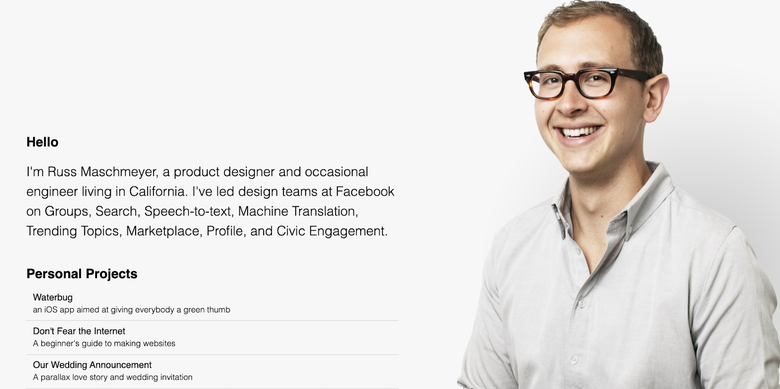
Maschmeyer teaches us all an important lesson here—the photo you choose doesn’t always have to be “professional” in a traditional sense. The shot of him laughing slightly makes him seem incredibly approachable, friendly, and exactly like someone we’d want to work with.
19.
This is a great example of how just a few images can elevate a website into something extra special. Rather than the background staying the same as you scroll through this site, the text stays the same but the background changes, giving you a great sense of Durlak’s design aesthetic.
20.
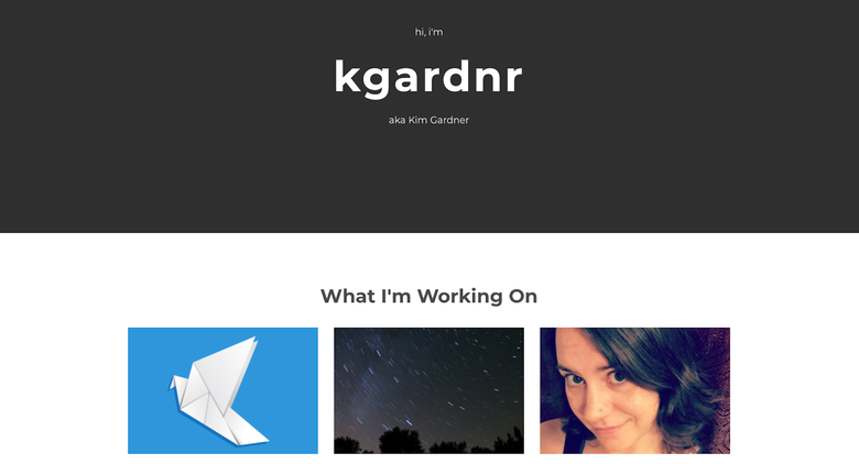
This simple page allows Gardner to share links to the many projects she’s currently working on without overwhelming a viewer. We could even envision her swapping out the projects every so often, so she can share her most relevant and impressive work at any given time.
21.
Stark’s page starts as 10 words and an email address, but as you mouse over each underlined word, more text appears, going into further detail, and with each text expansion there are more words to mouseover and expand further for an experience that really proves what you can fit into just one page.
22.
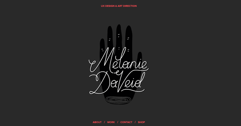
The fancy animations and scrolling features make this really fun to explore, but for people who don’t have technical chops can still learn something from DaVeid’s site: a website doesn’t have to be long and complex to be impressive. DaVeid just gives three samples of her work and a fairly short bio, and even keeps her design simple with only three colors and a couple fonts. But the result of this simplicity is quite stunning.
23.
This simple one-page site is almost entirely text, but tells the reader everything they’d want to know about Shoaf and his career while also showing the simple design aesthetic that carries over to his work. There is one additional page hidden among the links to Shoaf’s work—but we think it’s worth it.
24.
This online writing portfolio pairs each link to Firshein’s writing samples with a banner image and simple description of the topic. There are a few blocks of text describing Frishein throughout the scrolling page, but the article links are the most prominent parts of the site—which makes a lot of sense given the impressive publications Firshein has written for.