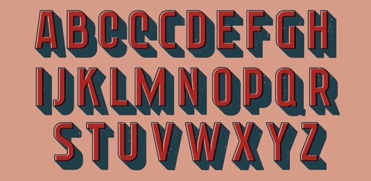
We’ve talked before about keeping the font on your resume, cover letter, and other business documents and communications simple and professional.
But sometimes, to stand out a little more, we want to step away from the Times New Roman. And if you’re not a designer or expert in typography, it can be hard to know how to step out of your font comfort zone—without ending up with a document that’s hard to read or looks way too gaudy.
For a little help, check out the infographic below. It offers one-step-above replacements for common fonts, as well as some fancier fonts when you want to upgrade headings in a report or on your website (we’d recommend avoiding the cursive in any work communication). Best of all? They’re all available for free download here!

